 Veronica Park is an author, journalist and world-traveler of many different past and future vocations. Keep an eye out for her first published novel, which will hopefully be announced soon. In the meantime, you can read about her exploits in the Caribbean and find out her opinion on pretty much everything by following her on Twitter (@VeroniKaboom) and checking out her website.
Functionality. Most people think this is the golden rule of resumes. But guess what, ladies and gentlemen? This may or may not come as a shock—judging by the current state of our government, waka waka—but we don’t actually live in a world where functionality is king.
No, we live in a world of skinny mocha lattes. And plastic surgery. And spray tanning. (Not that there’s anything wrong with that, mind you. I watched Jersey Shore, right along with five million other Americans.) The mere existence of these things suggests that most people today do, in fact, judge a book by its cover. And by extension, that means most potential employers will see your resume’s appearance as a reflection of your overall attractiveness. As a job candidate, that is.
Here are a few examples of resumes which, while functional, may underwhelm at arm’s length.
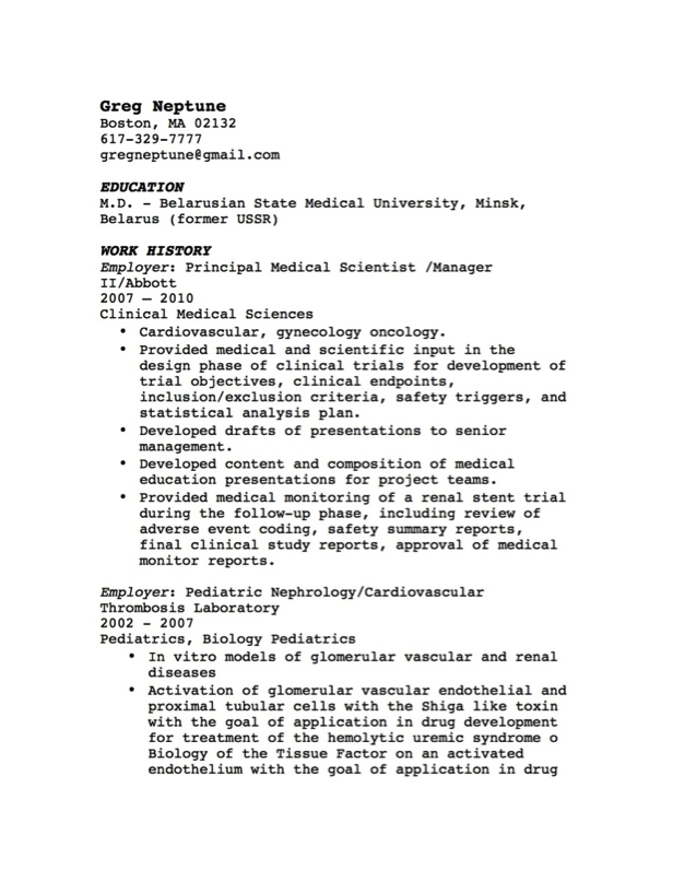
#1 – This resume is textually un-attractive:
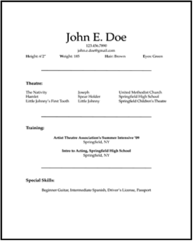
#2 – This resume is CLEARLY balding:
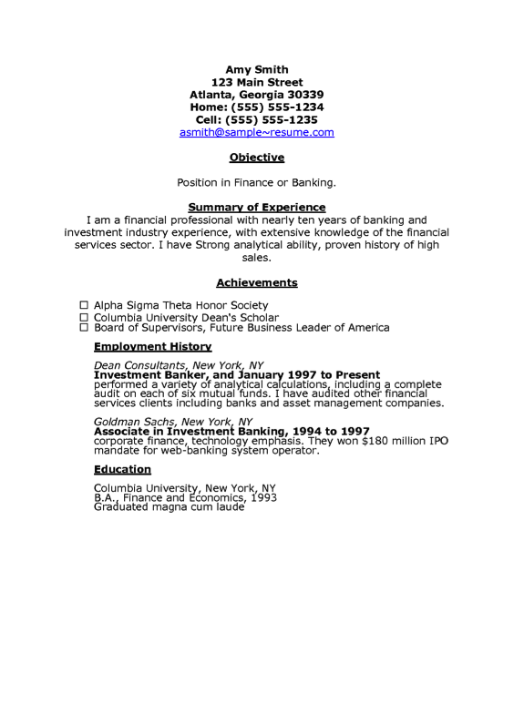
#3 – This resume is top-heavy, and (dare I say it?) a little bit “chunky”:
So. Now that I’ve rather snidely mocked a bunch of peoples’ perfectly functional resumes, I’m going to teach you a very SIMPLE method that has the power to take your resume from ho-hum to ka-pow!
I call this The Yard Test:
Step 1: Print out the current version of your resume. (Don’t have a resume? SHAME ON YOU. Go now and read the entire archives of this site. Then write a resume. Then print it. Then come back here. I’ll wait.)
Step 2: Take your resume and hold it out at arm’s length. (For most people, this will put the resume about a yard away from the face. I imagine that this is the approximate distance between a prospective employer’s eyeballs and the surface of their desk, upon which your resume will soon be resting.)
Step 3: Assess and critique your resume as objectively as you can, PURELY on the grounds of visual attractiveness.
- TEXT/FONT: Does your choice of text strike a professional, yet elegant chord? (If yes, good job!) Are you mostly using a universally accepted font, such as Times New Roman, Arial, Georgia, or Calibri? (Okay, nice. Nice.) Are you using MORE THAN TWO fonts? (If so, give yourself a light slap on the wrist, and go back and pick two complimentary fonts. Two is the MAXIMUM number of fonts you should use on a resume, and the number of your fonts shall be less than two. Sorry, little Monty Python reference there. Couldn’t be helped.)
- WHITE SPACE: If you’re unfamiliar with this term, GET familiar. White space is one of the most important factors in graphic design, visual merchandizing, publishing, really… any medium where text has to engage a human being and make them want to do something. (In this case: hire YOU.) Too much white space, and your resume will look sparse and puny, like Example #2. Too little white space, or white space that’s all crammed into one area (like Example #3) and your resume will look chunky, unwieldy and unreadable. And let’s be honest, the people who read these things read a LOT of them. So, let’s not give them any more reasons to want to skim through and ignore the details. Right?
- HEADER: This might seem silly, but when it comes to a resume your header is WHO YOU ARE. Your name is who you are. Your career persona (a one-sentence logline of what you can offer, which I will discuss in a later post) is who you are. Your address, phone number and e-mail, while important, are NOT who you are. That’s why your name needs to stand out and CLAIM this resume as unique. As YOURS. Example #3 totally misses the mark on this score. Example #2, on the other hand, goes a little bit overboard. Example #1 is close, but I’d like to see the name centered, and delivered in a more exciting font. I’d also like to see a title phrase in there, something along the lines of “Medical Scientist with Extensive Background in Laboratory Studies.” Something that pops out, toward the top, telling the potential employer everything he/she needs to know in a single line.
Step 4: Ask 2-3 of your friends to perform The Yard Test on your resume. For the sake of objectivity.
Step 5: Did your resume pass The Yard Test? If not, GO TO THE WEB. Google “resume samples” or “resume examples” and scroll through as many thumbnail-sized images of resumes as you can. Be as shallow and critical as possible. Rate them on a scale of 1-10 based on sheer attractiveness. LEARN from this. Copy what you like. Get rid of what you don’t like. There’s no such thing as plagiarism when it comes to formatting a resume. (Just make sure you don’t plagiarize another person’s skills or experience. Or their name. Especially their name. Actually, I’m pretty sure that’s super illegal.)
(Note: for added fun, you can even print a bunch of these out, dress up like Tyra Banks and stand in front of your friends and family like “There are thousands of resume examples on the internet. But I only have five resumes in my hands.” And Dear God, you’re now asking yourself. Can Veronica make any more gratuitous pop-culture references in a single post? Yes, probably. Don’t tempt me.)
Photo Credit: www.publicdomainpictures.net


